How to Customize the Look and Colors in Backtrader Charts

I decided to write this quick how-to because customizing Backtrader’s chart style isn’t exactly straightforward – and it took me a bit of trial and error to get it right.
If you’re also trying to adjust the look, colors, or layout of your Backtrader plots, I hope this helps you save some time.
Step 1. Define Your Color Palette
You can organize your color scheme using Python’s Enum, which makes your palette easy to reference and maintain.
from enum import Enum

# Order of colors matters when creating palette!
class Color(Enum):
    SKY_BLUE = "#87c2d6"
    PRUSSIAN_BLUE = "#022840"
    SAFFRON = "#eac450"
    ROSE_TAUPE = "#9e616a"
    GREEN = "#5c8272"
    CHARCOAL = "#234f66"
    OLIVINE = "#94b57d"
    LION = "#c4935d"
    OLD_ROSE = "#a97c83"
    SILVER = "#cacacb"


color_palette = [c.value for c in Color]
This approach allows you to easily reuse colors in multiple components without hard-coding hex values.
Step 2. Create a Custom Plot Scheme
Backtrader’s charts are controlled by a PlotScheme object.
By subclassing it, you can change the default chart look – including line styles, grids, spacing, and colors.
from backtrader.plot import PlotScheme

class CustomBacktraderScheme(PlotScheme):
    def __init__(self):
        super().__init__()

        self.custom_palette = color_palette

        # to have a tight packing on the chart wether only the x axis or also
        # the y axis have (see matplotlib)
        self.ytight = False

        # Distance in between subcharts
        self.plotdist = 0.25

        # Have a grid in the background of all charts
        self.grid = False

        # Default plotstyle for the OHLC bars which (line -> line on close)
        # Other options: 'bar' and 'candle'
        self.style = "line"

        # Default color for the 'line on close' plot
        self.loc = Color.CHARCOAL.value
        # Default color for a bullish bar/candle (0.75 -> intensity of gray)
        self.barup = "0.75"
        # Default color for a bearish bar/candle
        self.bardown = Color.ROSE_TAUPE.value

        # Wether the candlesticks have to be filled or be transparent
        self.barupfill = True
        self.bardownfill = True

        # Wether the candlesticks have to be filled or be transparent
        self.fillalpha = 0.20

        # Wether to plot volume or not. Note: if the data in question has no
        # volume values, volume plotting will be skipped even if this is True
        self.volume = True

        # Wether to overlay the volume on the data or use a separate subchart
        self.voloverlay = False

        # Default colour for the volume of a bullish day
        self.volup = Color.SILVER.value
        # Default colour for the volume of a bearish day
        self.voldown = Color.ROSE_TAUPE.value


    def color(self, idx):
        """
        Series colors are assigned in order starting from index 0.
        """
        return self.custom_palette[idx % len(self.custom_palette)]
Step 3. Customize Your Observers
To control the color and style of buy/sell markers and PnL dots, subclass the respective observers.
import backtrader as bt

class CustomBuySellObserver(bt.observers.BuySell):
    plotlines = dict(
        buy=dict(color=Color.OLIVINE.value),
        sell=dict(color=Color.ROSE_TAUPE.value),
    )


class CustomTradesObserver(bt.observers.Trades):
    plotlines = dict(
        pnlplus=dict(
            _name="Positive",
            ls="",
            marker="o",
            color=Color.OLIVINE.value,
            markersize=8.0,
            fillstyle="full",
        ),
        pnlminus=dict(
            _name="Negative",
            ls="",
            marker="o",
            color=Color.ROSE_TAUPE.value,
            markersize=8.0,
            fillstyle="full",
        ),
    )
Step 4. Run Your Strategy with the Custom Scheme
Finally, use your scheme and observers when plotting:
def run_strategy(strategy, data, cash):
    cerebro = bt.Cerebro(stdstats=False)

    cerebro.addobserver(bt.observers.Value)
    cerebro.addobserver(bt.observers.Cash)
    cerebro.addobserver(CustomTradesObserver)  # <-- Observer with custom colors
    cerebro.addobserver(bt.observers.DrawDown)
    cerebro.addobserver(CustomBuySellObserver) # <-- Observer with custom colors

    cerebro.adddata(data)
    cerebro.addstrategy(strategy)
    cerebro.broker.setcash(cash)

    cerebro.run()

    cerebro.plot(scheme=CustomBacktraderScheme(), iplot=False) # <-- Apply custom scheme
Final effect
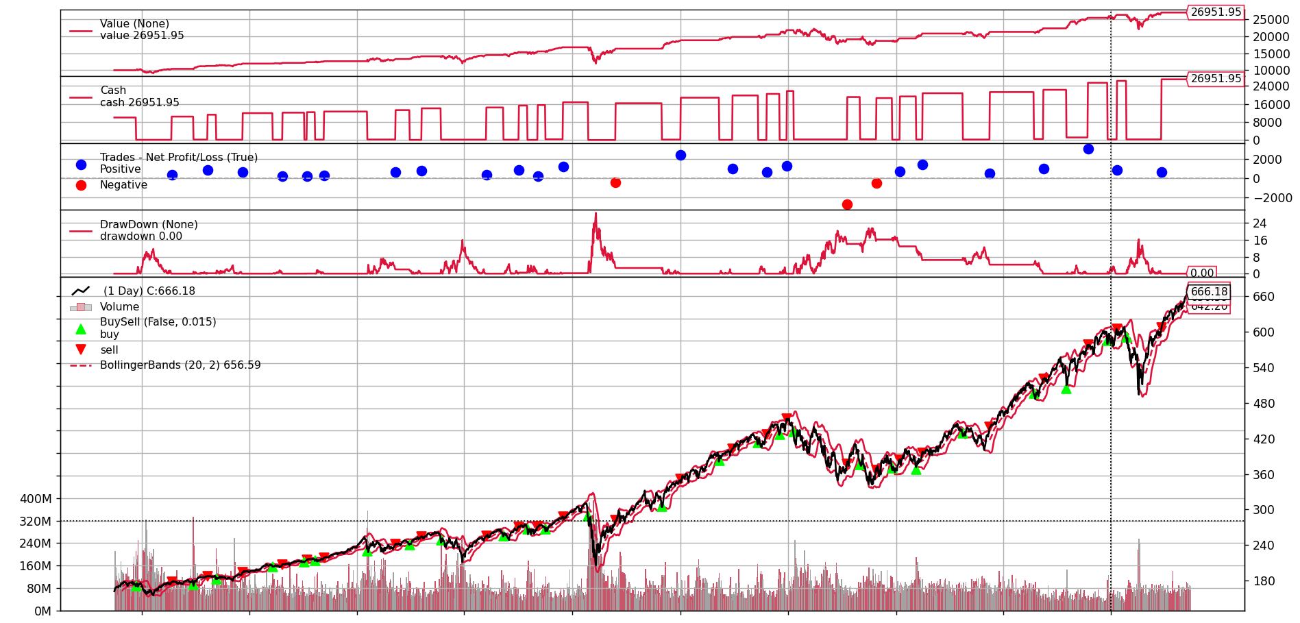
Before any customizations, the default chart looked like this:

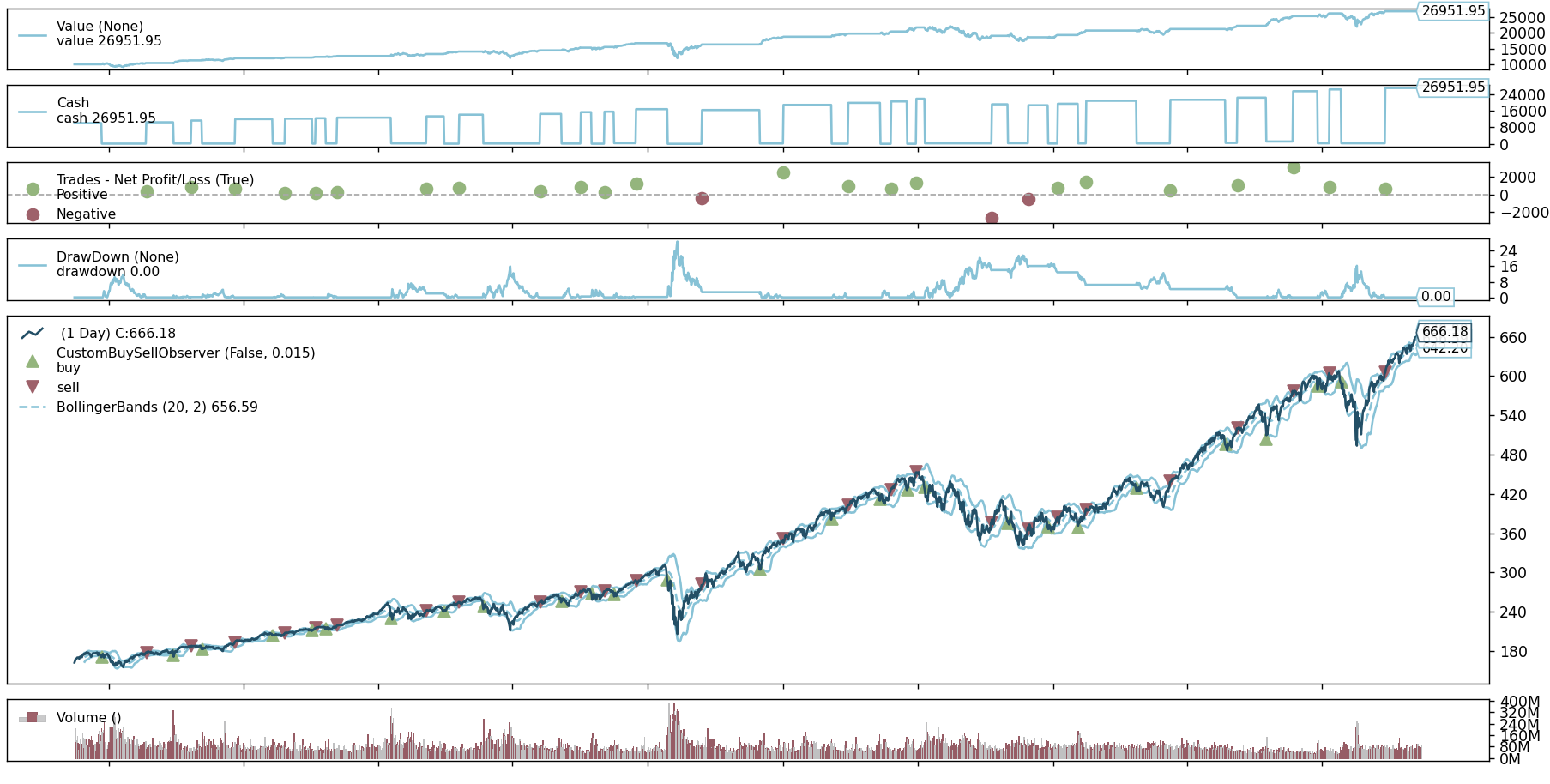
... and after polishing it a bit:

Summary
With just a few small changes, you can:
- Apply your own color palette
- Control the layout, grid, and spacing
- Customize buy/sell markers and trade PnL dots
It’s an easy way to make your Backtrader charts look clean, consistent, and professional – especially useful when preparing strategy reports or sharing visuals on your blog ;)


